Online Course
NRSG 795 – Biostatistics for Evidence-Based Practice
Module 7: Associations of Interval/Ratio Variables
Scatterplots and Correlations
The word correlation in statistics is most often used to reflect an association between interval/ratio level variables. A correlation refers to a bond or connection between variables.
Correlation analysis is a useful way to describe the direction and magnitude of a relationship between two variables.
For example, correlation analysis can be used to answer the question: How is respiratory function (measured in breaths per minute) related to anxiety level (a score) in patients living with chronic pulmonary disease?
Visual display: Scatterplots
The relationship between two variables can be displayed graphically on a scatterplot. A scatterplot consists of an X axis (the horizontal axis usually the independent variable), a Y axis (the vertical axis- usually the dependent variable), and a series of dots. Each dot on the scatterplot represents one observation from a data set. The position of the dot on the scatterplot represents its X and Y values.
Scatterplots are a visual display of the associations/correlation.
Below, on the left, a table shows the height and the weight of five starters on a high school basketball team. On the right, the same data are displayed in a scatterplot.
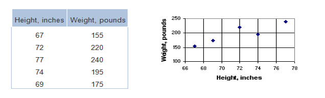
Each player in the table is represented by a dot on the scatterplot. The first dot, for example, represents the shortest, lightest player. From the scale on the X axis, you see that the shortest player is 67 inches tall; and from the scale on the Y axis, you see that he/she weighs 155 pounds. In a similar way, you can read the height and weight of every other player represented on the scatterplot. [Click for more information on scatterplots].
Statistically test association/correlation: Pearson’s r and Spearman’s rho
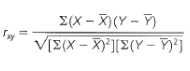
Pearson’s r
The most widely used correlation measure between interval/ratio level variables is the Pearson’s product-moment correlation coefficient (also called Pearson’s r). The null hypothesis is that there is no relationship between the variables, the correlation is zero (Ho: r=0) whereas the alternative hypothesis is there is a relationship (H1: r ≠0). The alternative hypothesis is nondirectional.
Click here if you want to see behind the scenes of what is going on via hand calculating a pearsons r]
Test assumptions and factors affecting Pearson’s r
The two most important assumptions of the Pearson’s r, is there should be a linear (i.e., straight line) relationship between the variables (check scatterplot) and the variables should have a normal distribution.
Several factors affect the magnitude of Pearson’s r. Always check for outliers because they may have a profound influence on the slope of the line. The magnitude can be reduced if the range of values on one of your variables is restricted or if your measure has a low reliability. The magnitude may increase if only extreme groups from both ends of a distribution are included in your sample.(click here to visualize) Other cautions include never compare estimates between studies where the range differs and DO NOT assume that there is a cause and effect relationship.
Magnitude and nature of relationship
The Pearson’s r directly conveys information about the magnitude and direction of the relationship (see below). It ranges from -1 to +1. A negative sign indicates that high values on one variable are associated with low values of the other variable. The magnitude of the relationship is the absolute value of the Pearson’s r. The higher the absolute value the stronger the relationship. The coefficient of determination, R2 tells us the proportion of variance in variable y that is associated with variable x (the proportion of variance that is shared by the two variables). When comparing the magnitude of different correlations it is more appropriate to use the R2.
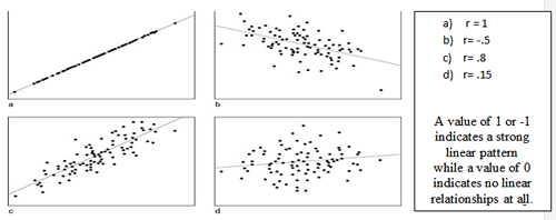
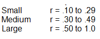
The scatterplot example a, c & d above shows a positive linear relationship-high values on one variable are associated with higher values on the other, while b illustrates a negative linear relationship. Plot a illustrates a perfect strong positive relationship. But when all of the dots are not in a straight line as plot c yet still in a tight cigar shape, this still reflects a large strength of the relationship. As the dots scatter more the relationship weakens. What r value is considered large or small? While authors vary in their interpretation, the following are common:
Correlation matrix
In most studies we have considerably more than two variables so authors often present a table such as the one below. It lists the variable names (C1-C6) down the first column and across the first row. The diagonal of a correlation matrix (i.e., the numbers that go from the upper left corner to the lower right) always consist of ones. That's because these are the correlations between each variable and itself (and a variable is always perfectly correlated with itself). To locate the correlation for any pair of variables, find the value in the table for the row and column intersection for those two variables

Click for additional information on correlation
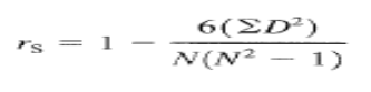
Spearman’s rho
If sample sizes are small (<30 cases) or the variables are ordinal level, a Spearman’s rho should be used. Although you would normally hope to use a Pearson product-moment correlation on interval or ratio data, the Spearman correlation can be used when the assumptions of the Pearson correlation are markedly violated, e.g., when one of both variables being correlated is severely skewed or has an outlier.
The Spearman's rank-order correlation is the nonparametric version of the Pearson’s r correlation.
Spearman's correlation coefficient (Spearman’s rho) measures the strength of association between two ranked variables. To calculate Spearman’s rho, we need to determine the rank for each person on each variable. [Click here if you want to see ‘behind the scenes’ of what is going on via hand calculating a Spearman’s rho]
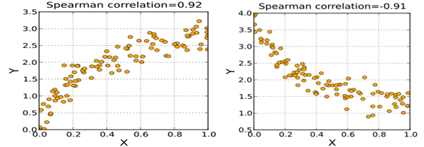
Spearman correlation results when X and Y are related by a monotonic function. Positive means as the rank of one variable goes up the rank of the other also increase.
Positive and negative Spearman rank correlations
For both the Pearsons r and the Spearmans rho, there are three interpretations to consider: the strength, direction, and significance of the association/correlation.
The correlation coefficient value measures the strength of the relationship (e.g., small, medium, or high). The negative or positive value indicates the direction (e.g., the strength of a correlation coefficient of -.5 is the same as .5). The significance reflects how much confidence you have that the results did not occur by chance. As with other inferential statistics, the calculated Pearson’s r or Spearman’s rho coefficients must be compared to a theoretical distribution with the specified sample size to determine the p-value. If the p-value is >=.05, then the null hypothesis of no association must be accepted.
One further warning: when samples sizes are >100, the p-values may be inflated such that small Pearson’s r or Spearman’s rho values can be highly significant. It is important that you consider the strength of the relationship since this reflects the effect size, regardless of the p-value.
Percentage of Variance Explained in a Relationship
The percentage of variance provides an understanding of the relationship or correlation between two variables in terms of practical importance or clinical importance.
To calculate the percentage of variance explained, square the r value then multiply by 100 to determine a percentage.
The stronger the r value, the greater the percentage of variance explained.
For example if r = 0.5 [(.5)2 × 100] ,then 25% of the variance in one variable is
explained by another variable and if r = 0.6 [(.6)2 × 100], then 36% of the variance is explained.
Any Pearson's r ≥ 0.3, which yields a 9% variance explained, is considered clinically important. Keep in mind that a result may be statistically significant (p < 0.05), but it may not represent a clinically important finding. Also remember correlation does not imply causation.
Effect Size
The r value is equal to the effect size or the strength of a relationship.
Presenting results
This is an example of how a result may be written for a scatterplot & Pearson correlation:
The scatterplot of the scores on the Beck Depression Inventory and the scores for Quality of Life showed that the points were in a narrow cigar shape from the upper left hand corner to the lower right hand corner. This would indicate a moderate to strong negative relationship between depression and quality of life. The strength and significance of the relationship between depression and quality of life was investigated using the Pearson Product Moment correlation. There was a large, negative correlation between the two variables (r=-.54, n=156, p=.007), with higher levels of depression associated with lower levels of quality of life.
Note: The description of the scatter plot should indicate direction and magnitude. Correlation findings should not only include the statistical information of the r coefficient, and p-value but also describe the findings in words of what the relationship is between the two specific variable
Required Readings and Videos
- Understanding Correlation (27:05) (STOP at 21:25)
https://www.youtube.com/watch?v=4EXNedimDMs - For additional information: https://statistics.laerd.com/statistical-guides/pearson-correlation-coefficient-statistical-guide.php
Learning Activity
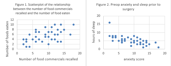
- Practice interpreting the scatterplots below using these questions.
- Check your response here
- Practice how to run a correlation. The Excel file HF_SSQ contains data from a study of 30 patients hospitalized with heart failure who participated in a randomized trial of three treatments: enhanced teaching in hospital, usual care in hospital, and enhanced teaching with home care. First create a scatterplot and then answer the question: What is the correlation between self-care (HF_SCI) and social support (SSQ)? What is your evidence (e.g., strength and direction, value and p-value)? Now also answer this question What is the correlation between age and social support (SSQ)?
- Check your answers to the learning activity questions
| Guide for those choosing to use IntellectusStatistics | Guide for those choosing to use Excel |
|---|---|
Refer to the hint sheet for how to run a correlation |
Refer to the hint sheet and watch this video for how to run a correlation in Excel - Hints of how to run a correlation in EXCEL - Excel for Statistics 6Correlation (6:35) https://www.youtube.com/watch?v=PnBOw4gR0ao Calculating a p value for a correlation coefficient calculated in EXCEL Use these directions or here is a link that you can just plug your r to get the p-value, instead of using Excel to calculate that. http://www.socscistatistics.com/pvalues/pearsondistribution.aspx - FYI: How to Calculate Spearmans Rank (in Excel)(9:28) https://www.youtube.com/watch?v=B81i3HIFZ90 |
This website is maintained by the University of Maryland School of Nursing (UMSON) Office of Learning Technologies. The UMSON logo and all other contents of this website are the sole property of UMSON and may not be used for any purpose without prior written consent. Links to other websites do not constitute or imply an endorsement of those sites, their content, or their products and services. Please send comments, corrections, and link improvements to nrsonline@umaryland.edu.