Online Course
NRSG 795: BIOSTATISTICS FOR EVIDENCE-BASED PRACTICE
Module 11: Testing Differences Over Time
Statistical Process Control Charts
Sigma Six
With the increasing emphasis on processes of care and quality improvement, business techniques are increasingly being applied to health care. One of these techniques or methodologies is “Six Sigma.” Sigma refers to the standard deviation of a distribution. Six Sigma relates to efforts to decrease variation in a process to within +/- three standard deviations (e.g., Six Sigma). The goal of Six Sigma is to limit process variation, thereby improving efficiency and outcomes. The tools and methodologies used during the six sigma process help to identify standard measurements to continuously monitor performance and achieve significant long-term improvements. Statistical process control (SPC) is one tool used during the six sigma process to examine and evaluate the significance of variations in process.
Control Charts (also known as Shewhart control charts)
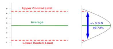
The control chart is the primary tool of statistical control charts. Data are plotted in time order allowing one to study how process changes overtime. Control charts rely on “control limits”, akin to what you know as confidence intervals. Control limits are set by the process and formulas, they are not the voice of the customer, rather they are the voice of the process. Control limits placed at three standard deviations from the mean in either direction provide an economical tradeoff between the risk of reacting to a false signal and the risk of not reacting to a true signal - regardless the shape of the underlying process distribution. If the process has a normal distribution, 99.7% of the population is captured by the curve at three standard deviations from the mean. Stated another way, there is only a 1-99.7%, or 0.3% chance of finding a value beyond 3 standard deviations. Therefore, a measurement value beyond 3 standard deviations indicates that the process has either shifted or become unstable (more variability).
How a Control Chart differs from a Run Chart
Since a run chart is a precursor of a control chart, many of the components outlined in the previous section [axis labels, title, goal, annotations, sample size] also apply when creating a control chart. Control charts differ from run charts on the following few aspects:
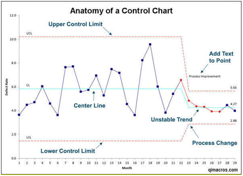
- Data Points Since a control chart provides a greater insight into variation in the data it is recommended that there be 15-20 data points at minimum.
- Center Line Control charts use the mean for the center line.
- Control Limit Lines
- Upper Control Limit (UCL) line which is calculated at 3 standard deviations above the Center Line.
- A Lower Control Limit (LCL) line which is calculated at 3 standard deviations below the Center Line.
Rules for identifying non-random signals
Control charts have their own set of rules for identifying special causes which are different from the rules applied to run charts. For a visual illustration of the patterns refer to the figure below.
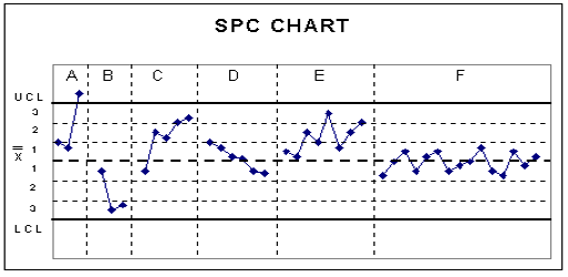
- Beyond Limits If one or more points falls outside of the upper control limit (UCL), or lower control limit (LCL) this indicates special cause variation exists in the process – (illustrated in section A in the figure above)
- Approaching control limits If two out of three successive points fall in the area that is beyond two standard deviations from the mean, either above or below special cause variation exists- (illustrated in section B in the figure above)
- If four out of five successive points fall in the area that is beyond one standard deviation from the mean, either above or below special cause variation exists- (illustrated in section C in the figure above)
- Trend A run of six or more points that are all either successively higher or successively lower indicate a non-random signal- (illustrated in section D in the figure above).\
- Shift/Run: Eight or more points falling on either side of the mean (some organizations use 7 points, some 9) are an indication that special cause variation exists in the process - (illustrated in section E in the figure above)
- Hugging the center line: If 15 points in a row fall within the area on either side of the mean that is one standard deviation from the mean special cause variation exists- (illustrated in section F in the figure above)
Interpretation
If there is no special cause variation then look at the average.
- The average tells us whether the process is good.
- A process can be in control but still be poor.
If there is a special cause variation then consider context.
- Is the special cause something you intended (ie, a change you introduced)?
- Is the special cause something you did not intend? If so, study the special cause.
When to Use a Control Chart
- When controlling ongoing processes by finding and correcting problems as they occur.
- When predicting the expected range of outcomes from a process.
- When determining whether a process is stable (in statistical control).
- When analyzing patterns of process variation from special causes (non-routine events) or common causes (built into the process).
- When determining whether your quality improvement project should aim to prevent specific problems or to make fundamental changes to the process.
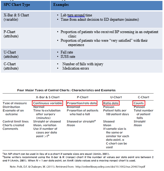
Types of charts
SPC can be used with any type of data collected over time. Both SPSS and Excel can be used to make SPC charts, however Excel has an add-in package (QI Macros) that makes the calculations and graphs much easier. In this subtopic you will read about different types of control charts that measure change over time and see common examples in healthcare.
There are two categories of control chart distinguished by the type of data used:
- Variable data (higher quality) comes from Quality Improvement: Measurement s on a continuous scale, such as: temperature, time, distance, weight.
- Attribute data is based on upon discrete distinctions such as good/bad, percentage/proportion defective, or number defective per hundred.
The type of chart is based on the type of Quality Improvement: Measurement .
Required Readings and Videos:
- Gupta M, Kaplan HC. Improving Quality Improvement in Neonatal-Perinatal Care. Clin Perinatol. 2017 Sep;44(3):xvii-xix. doi: 10.1016/j.clp.2017.06.002. pages 966-970.
- Polit, D.F. & Chaboyer, W. (2011). Statistical process control in nursing research. Research in Nursing and Health, 35, 82-93.
- Six Sigma in Healthcare (6:05) If you do not know what Six Sigma is, listen to this short video overview. http://www.youtube.com/watch?v=AqcvUUl2I-8
Learning Activity
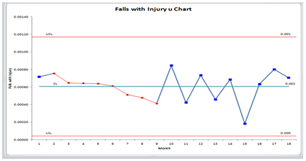
- Assume that you are a quality improvement coordinator at a 100 bed community hospital. In an effort to improve the fall with injury rate at your hospital. You convinced hospital senior leadership and the purchasing department to buy 25 low beds and 50 floor mats (2 for each bed). Patients who were deemed at high risk to fall were ordered a low bed and two floor mats. After 18 months of implementation, the CNO wanted to know if the purchase of low beds and floor mats made a significant impact on the hospital’s fall with injury rates. Evaluate the SPC charts below produced with an Excel add-in called QIMacros©. What would you conclude and what would you recommend to the Chief Nursing Officer? Click here when ready for answer.
- What type of process control chart should be used for my data?
As with all statistical tests, the level of data determines what type of statistical tests can be performed. In statistical process control, any type of data can be used to generate a process control chart, however the type of data being analyzed determines what type of process control chart is used. Refer to the Polit and Chaboyer article to determine what type of process control chart should be used in the following case studies.
Case Study 1
Background
Patient satisfaction scores in the preoperative screening unit are low and evidence suggests that scores are low due to long wait times. On average, patients wait an average of 23 minutes from the time they arrive in the unit to the time they are seen by a provider. Staff members are also unhappy with current state.
Intervention
Using Lean/Six Sigma tools such as process mapping and fishbone diagrams, the nursing staff and the NP provider staff developed a new process for patient screening that included a checklist, surgeon specific protocols and ordersets and a new patient chart system.
Outcome Data
Collected data include time of arrival, time of first encounter with the NP, and time of unit departure. What type of control chart should the council use to measure the effect of the intervention?
Case Study 2
Background
The core laboratory noticed an increase in mislabeled and unlabeled specimens; the majority of these samples were received from the ICUs. The quality manager for the lab partnered with the critical care quality council to examine processes.
Intervention
Using Lean principles, the stakeholders modified the entire specimen collection process, including label printing, collection of patient specimens, and specimen transport.
Outcome Data
The lab tracked mislabeled specimens weekly and summarized the data monthly. Available data include the number of mislabeled specimens and the total number of samples processed per month. What type of control chart should the quality council use to measure the effect of the intervention?
Answers to case study questions are found here. : - Think about data that are reported over time where you practice. These may be proportions, rates, events, means, etc. Select one measure and consider the following questions:
Could a control chart be used?
What type of control chart would be appropriate?
What factors might contribute to random variation in the measure?
What factors might contribute to special cause variation in the measure? - Complete the Module 11 Self-test
Optional
The following article is an example of how SPC was used to measure the effect of an educational interventional. If you are interested in SPC as a potential analysis method for your scholarly project, this paper provides an excellent example of a process and outcome measure analysis.
- Mottes, T., Owens, T., Nieder, M., Juno, J., Shanley, T.P., & Heung, M. (2013). Improving delivery of continuous renal replacement therapy: Impact of a simulation based educational intervention. Pediatric Critical Care Medicine, 14, 747-754.
If you are interested in trying to make more refined SPC charts, QI Macros is available for a 30-day free trial. The link is listed here:
http://www.qimacros.com/spc-software-for-excel/?gclid=CPSI6Y3m98ECFaPm7AodO3UAoQ
This website is maintained by the University of Maryland School of Nursing (UMSON) Office of Learning Technologies. The UMSON logo and all other contents of this website are the sole property of UMSON and may not be used for any purpose without prior written consent. Links to other websites do not constitute or imply an endorsement of those sites, their content, or their products and services. Please send comments, corrections, and link improvements to nrsonline@umaryland.edu.