Online Course
NRSG 795: BIOSTATISTICS FOR EVIDENCE-BASED PRACTICE
Module 11: Testing Differences Over Time
Run charts
A run chart is a line graph of data plotted over time. This lets you see changes -trends and patterns- over time which are important to process improvement. They do not use control limits, instead goal/target lines are plotted. Run charts reveal important information about a process before you have collected enough data to create reliable control limits.
Components of a good Run Chart
The figure below is an example of a run chart. First focus on the plot area and the axes.
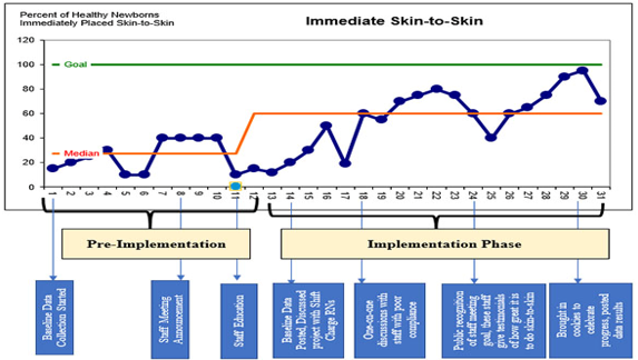
- Axis Labels: Notice the y axis (outcome unit) is labeled in this example as being a percentage and the x axis represents the time (days). Labels indicate the various phases of the project: pre implementation, implementation and post implementation (not shown on figure above) phases. Labels on the axis are very important.
- Data Points: A basic run chart needs a minimum of 10-15 data points, and usually needs 20-25 data points to detect meaningful patterns, especially if evaluating any interventions.
- Center Line: A center line based on the median (aka 50th percentile) is calculated from baseline data (illustrated in orange). The median is used because it is the point where half of the data points are expected to be above and below. It is not influenced by extreme points in the data. The chart may show a change in the center line if there was a change in the process following implementation. In the figure above the baseline (pre implementation) median is around 28% which then increased to 60% during the implementation phase.
- Goal: You will also want to draw a line indicating your goal (e.g., national standard). This is illustrated in the figure by the green line.
- Title: In addition to plotting the data it is important to include a title that names the measure.
- Annotations: This example also includes annotations that describe what is happening at various time points throughout the process. For example, on day 8 there was a staff meeting announcement, day 11 staff education. These notes let you know what is happening at different stages that may provide some insight into the variation observed. Annotations are not a required component of a run chart, however they can inform others of influential time points so it is nice to include ones important to your process.
- Sample size: Not shown on this example but including information on the sample size is also recommended.
What is a Run?
A run is a sequence of consecutive points that all lie on the same side of the central line (which in many charts is the median). Another way to recognize a run is if the previous and next values are on opposite sides of the central line. Values that lie exactly on the central line are ignored.
Four Rules for identifying non-random signals
Probability-based rules are used to objectively analyze a run chart for evidence of nonrandom patterns in the data. Three of the rules involve looking at patterns in the data while the fourth one involves counting the number of runs.
Rule 1 Shift: A shift is six or more consecutive points above or below the central line. When a shift occurs this is an indication that special cause variation exists in the process.
Rule 2 Trend: Trends are five or more consecutively increasing or decreasing points indicating that special cause variation exists in the process. This rule does not care whether the consecutive points are above, below, or crossing the central line.
Rule 3-Number of Runs: A non-random pattern is signaled by too few or too many runs, or crossings of the central line. To evaluate this you will first need to know how to count the number of runs. Here are two different ways to determine the number of runs.
- Count the number of times the data sequence crosses the central line and then add ‘1’.
- Identify the runs by circling them. Remember a run occurs when the previous and next values are on opposite sides of the central line. A run can consist of a single data point.

Next you count the useful data points- those not falling on the central line. Then to determine if the number of runs is too few or too many, we use a chart developed in 1942 by Swed and Eisenhart that is based on about 5% risk of failing the run test for random patterns of data. The chart determines the minimum and maximum number of runs required for each data point to follow random variation in the process.
Below is a portion of the chart. How do you use it? Using the example run chart where we identified 14 runs among 29 data points, we saw 2 of the data points were on the central line so we have to ignore them, thus there are 27 useful observations.
The chart indicates that for 27 observations the number of expected runs is between 10-19. Since the number of runs (14) is between those on the chart we conclude for our example run chart that no special cause occurred according to rule 3.

Rule 4 Astronomical points: Astronomical points occur when there is one value that is unusually different from the other data values on the chart. It would be a value that is highly unlikely to occur again and would appear as an outlier. It is subjective but don’t confuse it will the highest or lowest point as every chart will have them. Any dramatically different value indicates special cause variation.
Interpretation of a run chart: Meaning of what you see on the run chart
- Common cause variation
- The process is not changing over time (ie, intervention didn’t have a large or sustainable effect)
- Despite a statistical test indicating statistical significance, if you don’t see special cause variation, the change is not clinical meaningful.
- Special cause variation
- If you see special cause variation consider the context, is it something you intended or not (ie, a change you introduced)?
- Consider the type of rule (ie, a shift or trend indicating process change) and is it in the expected direction?
- If a statistical test indicates statistical significance and you have special cause variation, the change is clinically meaningful.
Required Readings and Videos:
- Perla RJ, Provost LP, Murray SK. The run chart: a simple analytical tool for learning from variation in healthcare processes. BMJ Qual Saf. 2011 Jan;20(1):46-51. doi: 10.1136/bmjqs.2009.037895.
- Gupta M, Kaplan HC. Improving Quality Improvement in Neonatal-Perinatal Care. Clin Perinatol. 2017 Sep;44(3):xvii-xix. doi: 10.1016/j.clp.2017.06.002. pages 965-966
- Using Run and Control Charts to Understand Variation (56:02)
https://www.youtube.com/watch?v=j4ZYHYJ0XUo
Learning Activity
Practice creating a run chart-see the guide area below for more help on how to do it.
- This first set of data is a look at a process measure on the number of immunizations given to eligible patients across the four clinics affiliated with your health center over a 20 day period. Begin by calculating the mean immunizations across all sites for every day. Then calculate the overall median. Use this data to create a run chart and check your work by comparing it to the answers provided here.
- Now you want to look into more detail by site with a goal to meet standards of immunizing 100% of those eligible. Now not only do you have the immunization count for site A, but you also have the number of patients seen that were eligible. What do you want to plot over time-think about what you need to calculate. Do you see any changes after this site had a seven day staff training to increase awareness and documentation? Use this data to create a run chart and check your work comparing it to the answers provided here.
| Guide for those choosing to use IntellectusStatistics | Guide for those choosing to use Excel |
|---|---|
| Hints to creating a run chart | Hints to creating a run chart (Office 365). |
This website is maintained by the University of Maryland School of Nursing (UMSON) Office of Learning Technologies. The UMSON logo and all other contents of this website are the sole property of UMSON and may not be used for any purpose without prior written consent. Links to other websites do not constitute or imply an endorsement of those sites, their content, or their products and services. Please send comments, corrections, and link improvements to nrsonline@umaryland.edu.