Online Course
NDNP 813 - DNP Project Evaluation and Dissemination
Module 2: Poster Presentation
Poster Presentation
 Professional poster presentations are often used as a means to disseminate evidence-based findings or communicate new ideas to colleagues. Many professional conferences rely on poster presentations to accommodate a greater number of presentations. The setting of a poster presentation enables the presenters to interact and dialogue with colleagues.
Benefits and Disadvantages of Poster Presentations
| Benefits | Disadvantages |
|---|---|
|
|
Guidelines for UMSON DNP Project Posters
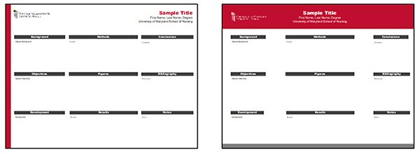
- Use one of the UMSON poster templates to develop your poster
- List your name and the name of your project faculty advisor as authors below the title
- Have the poster reviewed and approved by your clinical site representative and course faculty member before presenting it
- Do not use any identifiers of the organization in which your project was implemented on the poster unless you have written permission from the organization to include the names of other contributors to the project
- Check with your clinical site representative to find out if the organization requires any other review process and approval before presenting the poster , and follow the required processes.
Tips for Creating a Poster Presentation
Attention Getter: An effective poster is well organized, easily readable, and succinct. It is helpful to follow the 10-10 rule: the average person only spends 10 seconds scanning a poster from 10 feet away. The poster needs to grab their attention to convince them that it is worth spending more time.
Design: The flow of the poster should begin at the upper left track left to right and downward ending at the lower right portion. The layout often is in the format of 3-5 columns of information. The content of the poster should be based on the Standards for Quality Improvement Reporting Excellence (SQUIRE) guidelines and include:
- Header with title and authors
- Problem statement
- Purpose of the project with specific goals
- Methods
- Results
- Discussion with limitations
- Conclusions
- References
Less is More: One of the most common mistakes in the design of a poster is including too much information. Posters are a visual display that you invite the reader to move forward, similar to a window display. Posters should be clear, concise and appealing to the eye, and not cluttered with too much text. Information should be presented as bullets or brief statements that simplifies the message and can be viewed and processed within 3-5 minutes.
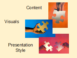
Visuals: The use of visuals in the form of graphs, photographs, and illustrations add interest.
Color: The careful use of color in a poster is a great way to reinforce the visual aspects and draw attention to the poster. A high contrast of different shades and hues of color reinforces the information presented and draws attention.
- Reds and yellows are energizing
- Blue and greens are calming
- Purple indicates authority and should not be used with darker colors
- White is severe but contrasts well with dark colors
- Black is impressive and can be a superior background for brighter colors
The color of the presenter's attire also appears to have an impact on the presentation. In a study of the presenter's attire, Keegan and Bannister (2003) found that when the color of the presenter's shirt was color-coordinated with the poster, the visitation rate to the poster was significantly higher as compared to when the color of the attire clashed with the colors of the posters.
Effective Posters
- Communicate visually a synopsis of your DNP project
- Serve as an illustrated abstract
- Not only attract, but also hold attention of the audience
- Initiate a discussion
- Are concise, organized and focus on a single clear message (this is where many fall short)
- Stand alone, if the presenter is not there
- Serve as an opportunity to get feedback and make connections with others
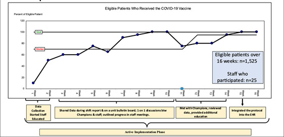
Run Charts in Posters
Include in run chart:
- strategies and tactics utilized
- when strategies and tactics were utilized
- total number of eligible patients over length of project
- total number of staff who participated in project
Copy run chart from Excel into Poster and then add arrows and boxes that include information that visually tells about the implementation phases of project.
Resources
The University of North Carolina Health Sciences Library offers a tutorial on Designing Effective Posters. This tutorial includes a poster evaluation check sheet to help you increase your awareness of and skill in designing posters, along with examples of posters that you can use for evaluation practice.
The University of Buffalo Libraries website offers links to a number of resources in poster presentations including poster design instructions, tips and hints, and sample online poster sessions.
Source:
Keegan, D.A., & Bannister, S.L. (2003). Effect of color coordination of attire with poster presentation and poster popularity. Canadian Medical Association Journal, 169(12), 1291-92.
This website is maintained by the University of Maryland School of Nursing (UMSON) Office of Learning Technologies. The UMSON logo and all other contents of this website are the sole property of UMSON and may not be used for any purpose without prior written consent. Links to other websites do not constitute or imply an endorsement of those sites, their content, or their products and services. Please send comments, corrections, and link improvements to nrsonline@umaryland.edu.