Online Undergraduate Course
Nurs 467 - Public Health Nursing
Module 4: Epidemiology, Communicable Disease and Emerging Infectious Diseases
Epidemiologic Frameworks
Frameworks provide structure, direction and guidance to public health nurses when dealing with complex health and social issues. Frameworks depict important factors and relationships, and can aid in the identification of relevant determinants that otherwise might be overlooked. The following frameworks are particularly helpful in epidemiology.
Epidemiological Triangle
The epidemiological triangle portrays the interaction of an agent (the "what"), host (the "who") and environment (the "where"). Traditionally, this model was used to describe communicable or infectious diseases, but the triangle can be used to determine the cause and/or the prevention of any disease.
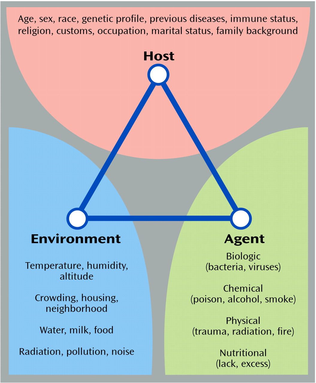
Read more about the epidemiological triangle here.. As you read about vectors, think about Lyme disease, malaria, and Zika, all vector-borne infections. However, the Zika virus is also sexually transmitted, making it much more difficult to study and prevent. Pay particular attention to the discussion about applying the epidemiologic triangle to a non-infectious disease. Can you use this model to describe conditions or diseases that you see at the place where you work?
Natural History of Disease in Man
The natural history of disease is seen as a continuum from pre-pathogensis (susceptibility) through asymptomatic stages, to clinical manifestation and eventual resolution. This model does two things: it explains how disease occurs, and explains the different activities the nurse can do to prevent, identify, treat and rehabilitate the person(s) with a disease. Levels of prevention (module 1) are related to these stages of health and disease, with primary prevention most relevant in the prepathogenesis period. Secondary prevention becomes applicable once the disease is present but before major problems occur. Tertiary prevention helps in the later stages of pathogenesis.
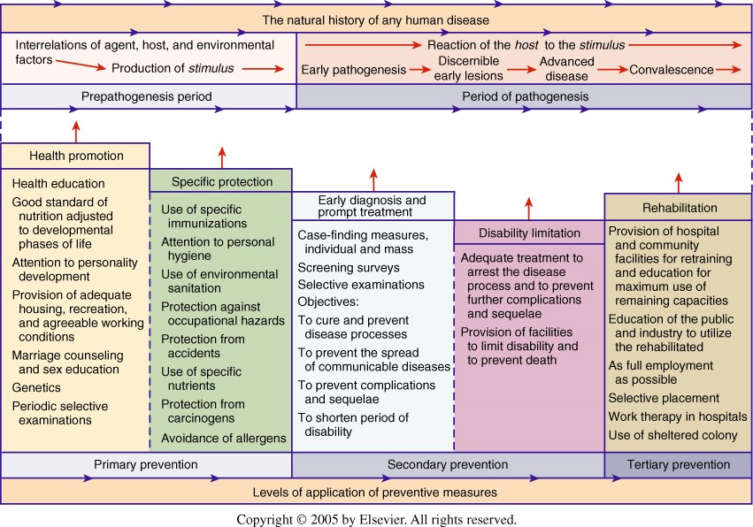
Read more about the natural history of disease here.
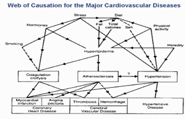
Web of Causation
The web of causation, a related concept to the epidemiological triangle, more adequately illustrates the complex interrelationships of numerous factors interacting to increase (or decrease) the risk of disease, particularly multifactorial diseases where no single cause can be identified. Here is an example for major cardiovascular diseases.
Ecologic Model
The ecological model for population health expands epidemiologic studies both upward to broader concepts and downward to the genetic and molecular level.
Learn more about the ecological model by watching this short video, and please pay particular attention to the discussion on obesity to see how to apply the ecological model to a common chronic issue.
Rates, Calculations and Charts
In order to determine the distribution of disease or exposure in a population, PHNs must understand key rates that are used to describe health. Detailed information on how to calculate these rates is included in the Epidemiology slide set that accompanies this module. PHNs must also understand how to interpret the tables, charts and graphs that display epidemiological data.
Tables
Tables are typically laid out in rows and columns. Often the columns will be used to compare two populations. Table 1 below shows health outcomes for people living in different towns. The percentages clearly indicate the proportion of each disease in the corresponding town. For example, 16% of the residents in Smalltown have high blood pressure.

Table 2 shows health outcomes for a population of people divided into high exposure to air pollution versus low exposure to air pollution. Again, the percentages indicate proportions of disease for the two different exposure levels.
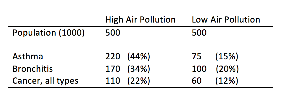
Another interesting way to look at this data would be to look across the rows. You need to do a little bit of math, but the results will give you an additional way to discuss the data. For example, it is evident that a higher percentage of people that are exposed to elevated levels of air pollution are diagnosed with asthma, when compared to low exposure. But that difference becomes even more pronounced if you take all of the people with asthma (220+75=295) and figure out what percentage of them have been exposed to high levels of air pollution (220/295=75%). In other words, 75% of the people with asthma were exposed to high levels of air pollution.
Charts and graphs
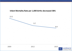
Graphs and charts can sometimes show data in clearer and more powerful ways than tables. Line graphs are useful for showing what happens over time (for example, infant mortality rate in Baltimore over six years). Time is usually on the x axis in line graphs.
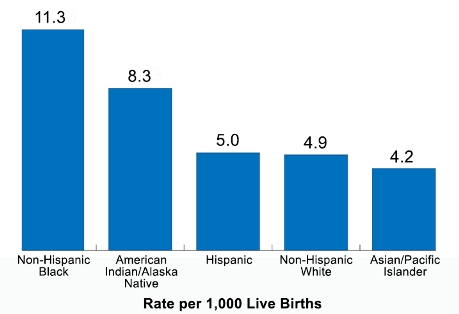
Bar graphs enable the comparison of different populations (for example, infant mortality rate for different ethnicities in a single year).
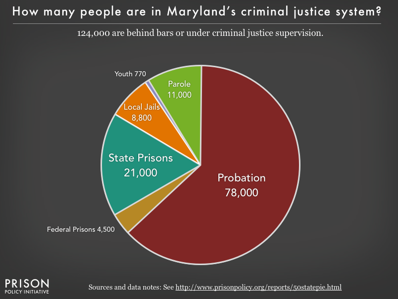
Pie charts help to decipher how something may be divided into parts (for example, the distribution of people in Marylands criminal justice system).
PHNs must be proficient at reading and interpreting data from tables, charts and graphs. Watch this short video to learn about how Florence Nightingale brilliantly displayed mortality data to show connections that may not have been evident otherwise.
This website is maintained by the University of Maryland School of Nursing (UMSON) Office of Learning Technologies. The UMSON logo and all other contents of this website are the sole property of UMSON and may not be used for any purpose without prior written consent. Links to other websites do not constitute or imply an endorsement of those sites, their content, or their products and services. Please send comments, corrections, and link improvements to online@son.umaryland.edu.